How is everyone recovering after the Great Easter Chocolate Avalanche? I’m still reeling from the shock of this year’s slimlined, and frankly, suspiciously squashed-shaped chocolate eggs. Hopefully, yours didn’t sport the rather alarming cone-like appearance mine did. It was less “egg” and more a “geometric curiosity.”
Mine was dutifully delivered by the Easter Bunny, who, we suspect, performed some impressive acrobatic feats in the night in order to get in through the now-redundant cat flap in the back door. Chocolate eggs were everywhere, much to little X’s chargrin. There were even some outside, which we made light work of bringing in.
After a fortifying breakfast of said chocolate eggs (don’t judge, it’s practically tradition), I managed to drag myself up to the village church. The cherry blossoms (lovely members of the Prunus genus) were putting on a real spectacle – petals dramatically raining down like confetti after a particularly enthusiastic wedding. Of course, I’m here for all the cherry blossom drama, so I dutifully scooped up any remaining flowers that had managed to stay somewhat intact and whisked them home, like a floral magpie.
I thought they looked absolutely beautiful against my green tablecloth, which immediately reminded me how much I adore the contrast between a soft sage green and pink. There’s a gentle, almost flirtatious relationship between the two that just sings to my eyeballs – a true colour power couple.
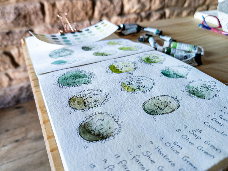
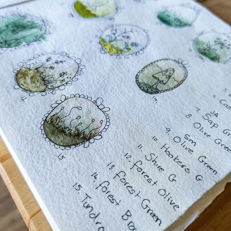
Speaking of flirting with green, it’s that time of year again: my annual showdown with Sap Green begins anew. I know, I know. It’s a ridiculously popular colour. It’s so zingy and bright! It practically screams “spring!” and “lush!” just like the vibrant world outside my window. So why, you ask, am I picking a fight with this perfectly innocent tube of Daniel Smith paint?
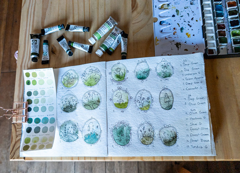
Urgh, honestly, I haven’t a clue. I’ve had the same tube for what feels like an eternity, and I keep giving it the cold shoulder, bypassing it for its more understated comrades. It’s neglected in my paintbox. Part of me suspects it’s because there are other greens I’m completely besotted with, like Undersea Green (uff, chef’s kiss!). Now that one’s a bit less of a show-off and really knows how to make muted colours pop. It’s the strong and silent type of the green world.
I can practically hear the collective gasps from fellow Daniel Smith aficionados. But fear not, because as I’m typing this, a little lightbulb (probably a low-wattage) has gone off: my issue might be because Sap Green plays so nicely with those bright, almost acidic yellows. Also, not colours I’d normally invite to my palette party. Well, unless a painting specifically demanded their presence. Which, as fate would have it, one journal entry did.
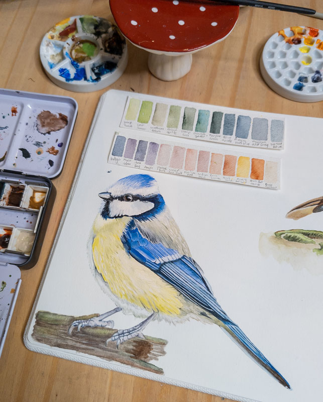
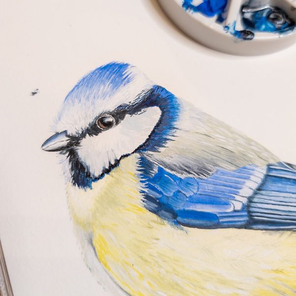
As you can see, I reluctantly dipped my brush into this brighter yellow/green spectrum to capture a recent blue tit (Cyanistes caeruleus) visitor. I had to convey the sheer, unadulterated flashiness of my feathered friend in all its acidic glory – who, I should add, was also incredibly noisy. A tiny, brilliantly coloured diva, truly, with the lung capacity of an opera singer.
Anyway, my point is, the whole acid-yellow-into-lime-green side of the spectrum isn’t my natural habitat. I think I find it a bit… well, garish? Harsh? Like a visual assault of perkiness that my inner brooding artist just can’t handle. I’m not entirely sure; maybe it’s my dark gothic underbelly making its presence known. But I’d be genuinely keen to know if there’s anyone out there willing to show me some Sap Green (or even its equally challenging cousin, Serpentine Green) magic. What does it pair up nicely against? Spill the beans! Or send help (and colour swatches, please!).
My palette, and my sanity, may depend on it.