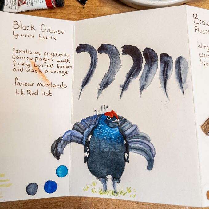
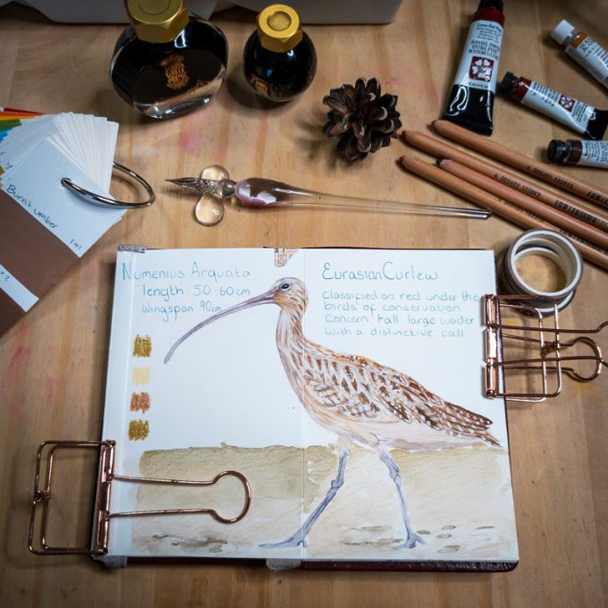
This is part two of my behind-the-scenes look at how the Champion Species pin badges have been created. If you’re interested in reading part one, which covers my traditional artwork approach, you can find it here.
Today, we’re stepping into the digital realm of illustration. I should start by saying that some people feel digital art isn’t as ‘worthy’ as traditional methods. That’s a whole debate for another day, but I’m hoping that by describing my approach, I can help to show how, in my view, it’s simply a different set of skills, equally thoughtful and nuanced.
I create my digital drawings using a Wacom tablet with Adobe Photoshop, and also Procreate on my iPad with an Apple Pencil. The digital brushes I use are often designed to mimic the real-life tools I love – typically gouache, watercolour, and graphite pencils. Many of my favourite brush sets were sourced from talented creators like Nathan Brown and Liza Glanz (via Design Cuts, a marketplace many digital artists will know sadly closed its doors recently). I also have a few cherished brushes from other artists I admire, like Poopikat, and some I’ve picked up from various online sources over the years.
The importance of quality digital brushes really can’t be overstated; the logic is much the same as buying good traditional art supplies. They are easier to work with, behave more predictably, and act as a true companion to an artist’s individual style. Ultimately, they help to showcase my strengths.

For the badges, I created digital art files that were precisely 3cm by 3cm, at a resolution of 300dpi (dots per inch), and in CMYK colours. For my process, I often work with Pantone colours on a colour-calibrated monitor because I appreciate the consistency Pantone offers during the design phase. However, the manufacturer’s equipment prints in CMYK, so it’s crucial to bridge that gap.
This careful setup means I can be confident that what I’m drawing will look good when it’s finally produced. The high resolution ensures clarity, drawing to size helps me gauge its fidelity and composition accurately, and the colour management work helps to iron out any unwelcome surprises when the designs go to print.
I typically start the digital illustrations in Procreate using a graphite pencil brush, with my original sketchbook artwork on screen as my main reference. I also keep that pool of photo references handy in case I get stuck on a particular detail, but generally, by this point, the foundational work is done. These tiny drawings come together relatively quickly. Then, I begin adding colour using my watercolour and gouache brushes, selecting from Pantone swatches I’ve preloaded into my digital art palette.
At this stage, I don’t overly worry about forcing a specific ‘style’ because my natural way of drawing tends to ensure they all look consistent as little, simplified studies. The aim is for them to clearly look like a cohesive series, as though they all belong together.
The final step for the badge artwork was to export the full collection and send it off for sign-off. This ensures the Forest of Bowland team are happy with everything before the designs go to the manufacturer and into production.
With the badge designs complete, I switched modes and put my ‘design cap’ on, as one last, important task remained: the backing cards.

The badges themselves are lovely, high-quality brass with a protective front dome, giving them a feel reminiscent of old jewellery but with a modern twist. Knowing these details intimately gave me insight into what kind of backing card would truly make them shine.
I envisioned the backing card design acting as a perfect, minimal backdrop, yet bold in colour. Using colour wheel theory and contrasting colours as a strategy, the goal was to make the badges really ‘pop’. The cards were designed following the manufacturer’s size guidelines, including a 3mm bleed edge (extra space for trimming), and again, created at 300dpi in CMYK, referencing my Pantone work for colour accuracy.

Perhaps the longest part of this particular process was landing on the exact right contrasting colour array – one that would create a strong, identifiable ‘brand’ image for the collection. The right contrast would make the brass badges stand out beautifully. A loose ‘rainbow’ of card colours naturally emerged from this exploration, bringing a sense of harmony to the whole set.

To my eyes, they look quite yummy and irresistible, like brightly coloured packets of treats all housed together! I deliberately aimed for a modern and clean typographical feel, with a few subtle nods to vintage signage for character. They form a vibrant series, and I hope they invoke a feeling of joy and celebration for these special species.
I truly hope this two-part journey has given you some insight into the passion, thought, and skill that has gone into creating these pin badges – wearing both my artist and designer hats to bring them together, ready for their next exciting phase: being sent off to the manufacturer!
I should have some more behind-the-scenes posts to share with you soon. My next task is to photograph the finished badges, so the Forest of Bowland team has a suite of promotional and product photography at their fingertips. I look forward to sharing that process with you once the badges arrive from the manufacturer.